
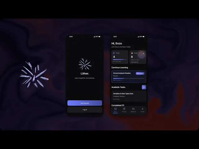

9:41

Lither.
Learn together. Everywhere.
Get Started
Log In
Hi, Enzo
Let's focus and learn today
Today
4
of 5 task goal
Streak
8
days in a row
Keep going!
Continue Learning
Circuit Analysis Practice
Physics
In Progress
33% complete
Available Tasks
Variables & Data Types Quiz
Computer Science
Due Friday
Completed (1)
Ohm's Law Problems
Physics
9:41
Tasks
Groups
Materials
Profile
ROLE
Product Designer
TEAm
2 Designers
Skills
UXR & Testing, Product Thinking, Design Systems,
Visual Design, Interaction Design
tools
Figma,
Figma Make,
FigJam,
Illustrator
Duration
Nov -
Dec 2025
OVERVIEW
Many study tools help users get started, but fall short once learning is actually in progress. Some feel emotionally flat. Others rely on heavy gamification that becomes distracting or stressful.
Lither explores a middle ground: a focus-first study app that feels calm at rest, responsive during use, and encouraging at key moments:
THE CHALLENGE
Study Tools fail… a lot
Students want help staying focused, but most study tools fail them at the moments that matter most.
While many tools help users begin studying, they rarely support what happens once learning is underway. As motivation dips, tools either remain static and emotionally unresponsive or introduce mechanics that compete for attention. Collaboration adds another layer of friction, often forcing students to leave their focus environment just to share work.
Focus apps often feel too rigid and emotionally flat
Gamified apps can be too distracting or stressful
Study tools barely support how students collaborate
The core issue wasn’t time management or task setup. It was sustained engagement, both individually and collaboratively.
RESEARCH & DISCOVERY
Making it engaging as possible

I interviewed 5-7 students and collected 20+ survey responses to understand how students study beyond timers and task lists.
From interviews and survey responses, several frustrations came up repeatedly:
"Once I start studying, the app doesn't really help me anymore"
"Gamification feels stressful when I'm already behind in material"
"I end up switching apps just to share my work anyway, and I get distracted after that"
Synthesizing interview notes and survey responses revealed two recurring problem patterns that explained why existing study tools felt insufficient.

IDEATION
Initial approach
I began ideation by exploring the most obvious direction: a Pomodoro-style, focus-centered app.

Early wireframes centered heavily around timed focus sessions, rigid intervals, and countdown-driven progress. The experience was clear and structured, but it quickly became apparent that this approach wasn’t solving the real problem.
Once a session started, the app’s role was essentially finished. It counted down time, but offered little emotional or motivational support when focus naturally dipped mid-session. The experience felt interchangeable with dozens of existing Pomodoro apps and didn’t meaningfully differentiate itself.
More importantly, it didn’t align with what students actually struggled with.
Through testing and reflection, it became clear that the issue wasn’t starting a timer. It was staying engaged once the novelty of the session wore off. A timer alone didn’t help with that.
Exploring the extreme opposite
I then explored more expressive, gamified concepts inspired by learning apps like Duolingo

These versions introduced frequent rewards, badges, and visual feedback. While they felt engaging at first, they quickly crossed into distraction and pressure, especially during longer study sessions.
At the other end of the spectrum, ultra-minimal concepts removed almost all UI during focus. These designs felt calm, but left users feeling unsupported when motivation dropped.
Each extreme addressed part of the problem, but none addressed it fully.
The Turning Point
The project shifted when I reframed the goal. Instead of asking how to build a better focus timer, I asked how to design an experience that supports focus over time.
This led to key decisions:
Focus sessions would remain minimal for users, but not fully invisible, and its intuitive
Motion would be used as a form of feedback, not just decoration
Encouragement would replace pressure-based gamification
Collaboration would be centered around shared learning artifacts, not just constant messaging
USER FLOWS
Validating the Direction
To test whether this new direction actually worked, I mapped a core user flow during ideation. Rather than documenting every possible path, I wanted the flow to focus on a single learning loop: completing work, sharing it, and receiving feedback without leaving the app.
This flow helped validate that collaboration, feedback, and motivation were structurally supported rather than layered on later.


Mapping this flow early surfaced unnecessary steps and confirmed that the product could support learning without timers, rigid rules, or automated evaluation.
ITERATION
Iteration through Reduction

As the design matured, iteration became less about adding features and more about removing them.
I intentionally:
Cut rigid Pomodoro constraints that limited flexibility
Designed one signature idle animation instead of many competing motions
Reduced gamification to a small set of meaningful milestones
Differentiated feedback for closed-ended versus open-ended work

Each iteration was guided by a single question:
Does this support focus, or does it compete with it?
Visual Design & Theme

DESIGN SOLUTION
The Result: Lither
The experience is intentionally quiet by default. Screens are minimal, visual noise is reduced, and motion is used sparingly to signal progress or completion without competing for attention.
Design principle: if it doesn’t support learning and engagement, it doesn’t belong.

Feedback is handled through a group chat system, not automated correctness states.
Open-ended work such as written responses or diagrams is shared directly in group chats, where feedback comes from peers in context.

Collaboration is built around sharing work, not conversation. Students can attach quiz drawings, diagrams, images, PDFs, and documents directly in chats, keeping discussion grounded in learning artifacts and reducing the need to switch apps.

Motivation comes from light, intentional signals. XP, streaks, and achievements are limited to meaningful milestones and never compete with learning or discussion.
REFLECTION
Impact & Outcomes
By the final iteration, Lither delivered a clearer and more trustworthy learning experience. I tested the prototpe with 6 students:
83% of students (5 out of 6) reported feeling more engaged during longer study or problem-solving sessions, especially after the initial drop in motivation
67% of students (4 out of 6) said the experience felt less stressful than tools they currently use, citing the absence of rigid timers and pressure-heavy gamification
More than half
reported fewer context switches during group study, since files could be shared and discussed directly within the app.
Lessons from a Fast Sprint
